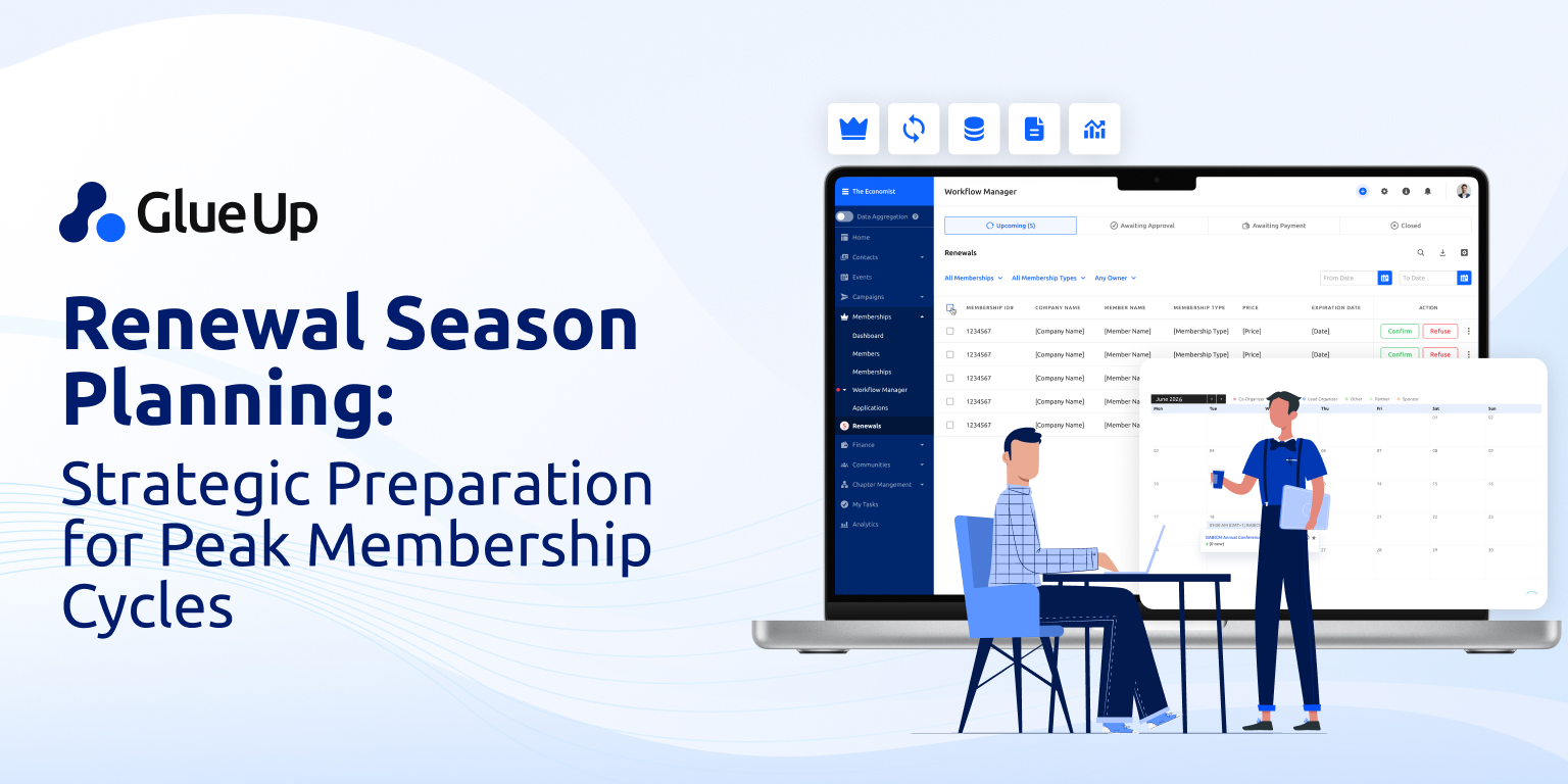
It’s easy to picture a membership website as a digital brochure with a login button. But is the truth? That idea is outdated—and it is costing organizations members, engagement, and revenue. In today’s competitive landscape, the best Membership Websites Examples (How to create one) are not just online hubs. They are engineered experiences that blend public-facing credibility with members only content, gate content that converts potential members, and exclusive content that keeps paid membership renewals climbing year after year.
This is not about ticking a box on your tech to-do list. It is about building a living, breathing online platform that becomes the heartbeat of your organization—something that ties together your events, member benefits, advocacy work, online courses, and digital marketing strategy into one seamless member only environment.
The good news? You do not need to guess what works. You can study the patterns in successful membership sites, understand why they work, and apply them to your own association, chamber, or nonprofit. That is exactly what we will do here.
A membership website is more than a brochure. It is a two-door experience: one for public value that attracts potential members and another for members only content that drives engagement and retention.
Studying real membership websites examples is the fastest way to improve your own. Patterns like prioritizing top member tasks, segmenting content, and showcasing trust signals can be directly adapted for associations and nonprofits.
Design and content choices determine success. Effective sites show value before login, onboard members in context, focus the homepage on four core jobs, and invest in a personalized member portal.
The best platform depends on complexity. Small organizations may succeed with builders, but associations and nonprofits benefit most from all-in-one solutions like Glue Up that integrate events, payments, CRM, and exclusive content delivery.
Execution matters as much as cost. Regardless of budget, success comes from clearly mapping free versus paid membership benefits, optimizing for top member tasks, and launching with a feedback-driven improvement process.
Quick Reads
What a Membership Website Is
A membership website is more than a static set of pages with a “Join” button. At its core, it is the digital twin of your organization’s value proposition.
It has two doors.
The first door—the public side—welcomes potential members. This is where free content lives: articles, event previews, introductory videos, or limited access online courses. The public side’s job is to build trust, prove relevance, and offer an irresistible reason to open the second door.
The second door—the members only side—houses the exclusive content. This can be a wide range of gated resources: live event registrations, on-demand webinars, member directories, job boards, advocacy alerts, discounts, and community forums. It’s also where paid membership delivers tangible ROI through tools that save time, create opportunities, and keep members connected.
A great membership website has a membership model designed to funnel users from the public side into the private side through a carefully crafted combination of digital marketing, social media outreach, and strategically placed gate content. This is not about locking everything away. It is about showing enough to convince potential members they belong inside.
Membership Websites Examples You Can Learn From
The fastest way to create a great membership site is to study real ones, decode their strengths, and adapt them to your membership option and audience. These examples come from associations and nonprofits, but their patterns work across industries.
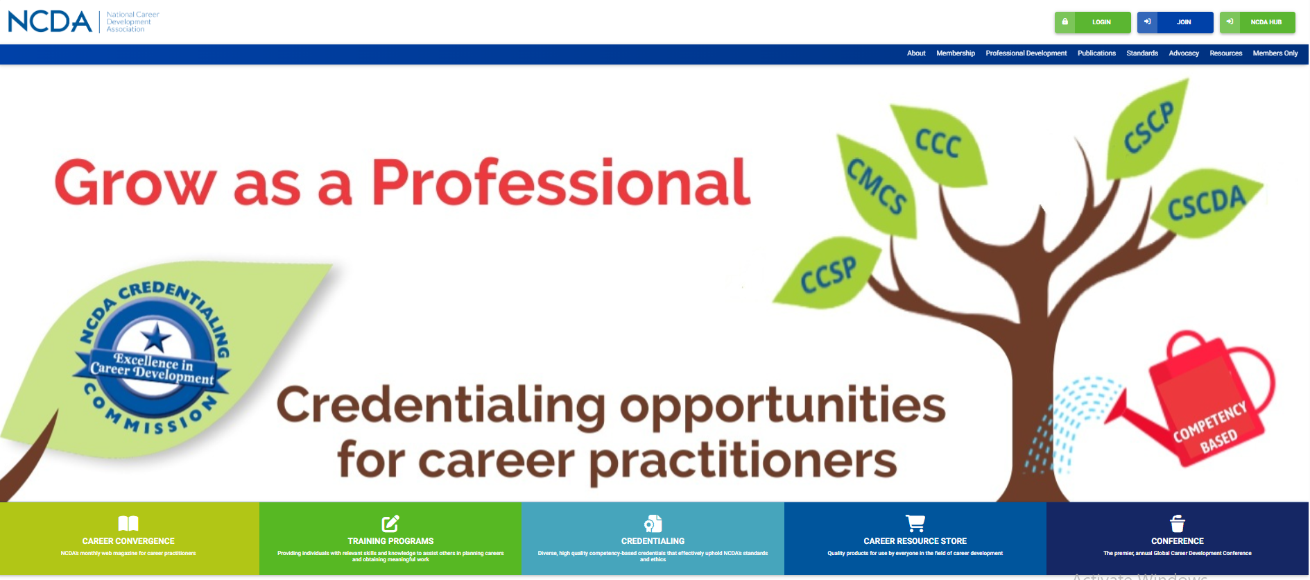
What They Do Well: Their homepage does not bury the lead. Right in the hero banner, you find career development tools, advocacy updates, and a clear “Join Now” button.
Why It Works: Members join for outcomes, not abstractions. By putting the top benefit front and center, NCDA makes its value proposition immediate.
How You Can Apply It: Move your highest-impact member task—be it event registration, CE credit tracking, or advocacy alerts—to the top of your homepage. If it matters most to members, it should be the first thing they see.
Upper Midwest Translators and Interpreters Association (UMTIA) – Segmentation for Relevance
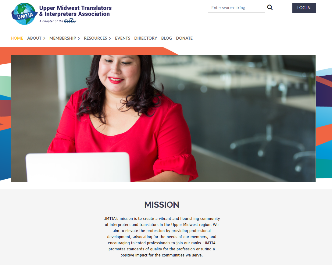
What They Do Well: Their content is segmented by member type, with tailored resources for translators, interpreters, and students.
Why It Works: A one-size-fits-all homepage risks alienating key segments. Segmentation respects each visitor’s unique goals.
How You Can Apply It: Create audience-specific entry points on your homepage. Use your CRM or platform’s personalization tools to show relevant content based on membership level or profile.
Arizona Airports Association (AzAA) – Join and Donate with Zero Friction
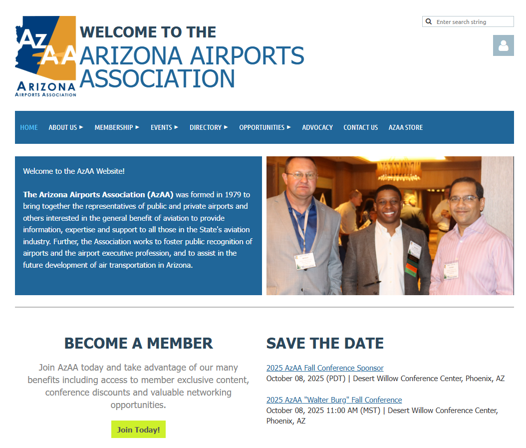
What They Do Well: Their join and donate calls to action are above the fold, and sponsors are visibly integrated.
Why It Works: Visitors should never hunt for your conversion points. By placing membership and donation prompts where the eye naturally lands, AzAA removes barriers to action.
How You Can Apply It: Pair your “Join Now” with a micro-link to “Why Join” that opens a 30-second read. Keep sponsor logos visible to reinforce your network’s strength.
Association of Leadership Educators (ALE) – Turning Benefits into Revenue
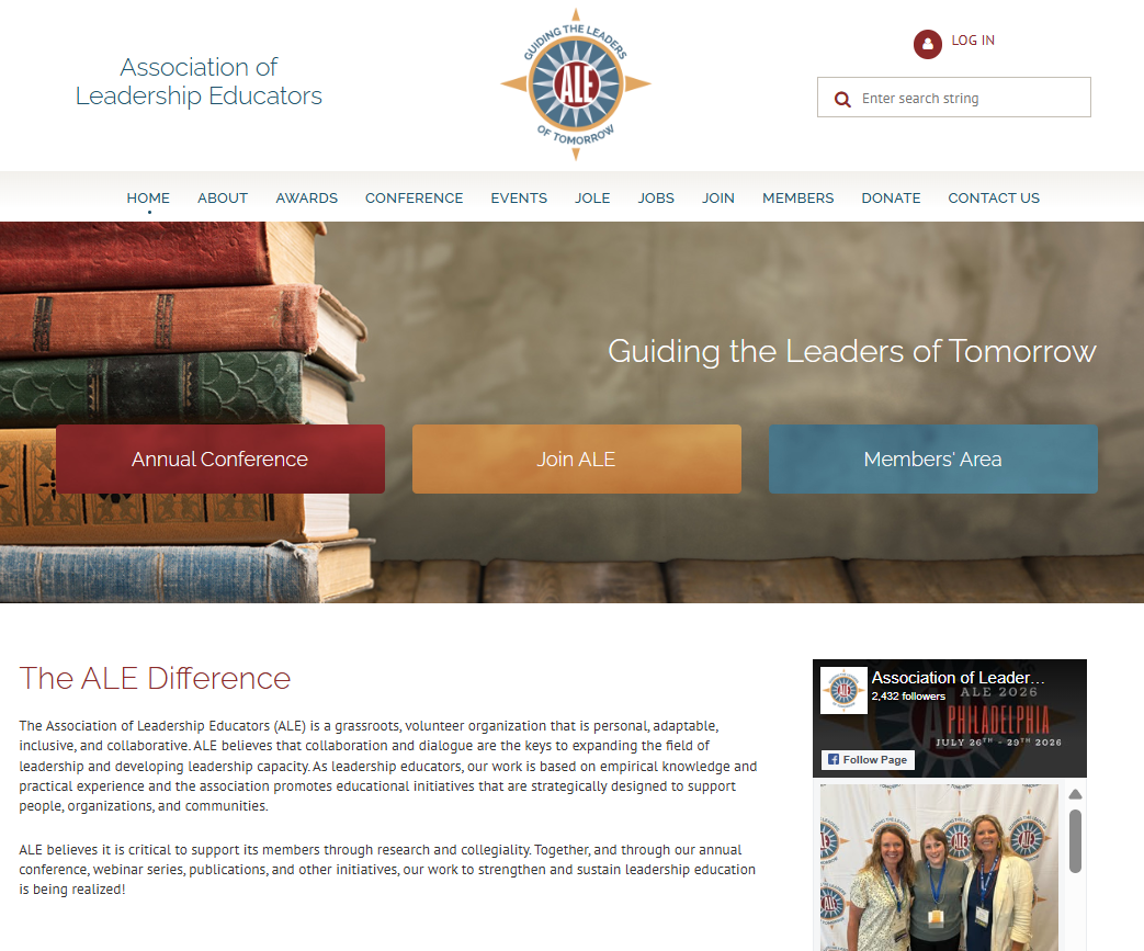
What They Do Well: Their members area includes a job board that is both a member perk and a non-dues revenue stream.
Why It Works: A feature that serves members and generates income is a win-win for sustainability.
How You Can Apply It: Add a job board, online courses, or marketplace accessible by membership levels. Price it for non-members but make it free for paid membership.
ASPCA – Donation UX that Converts
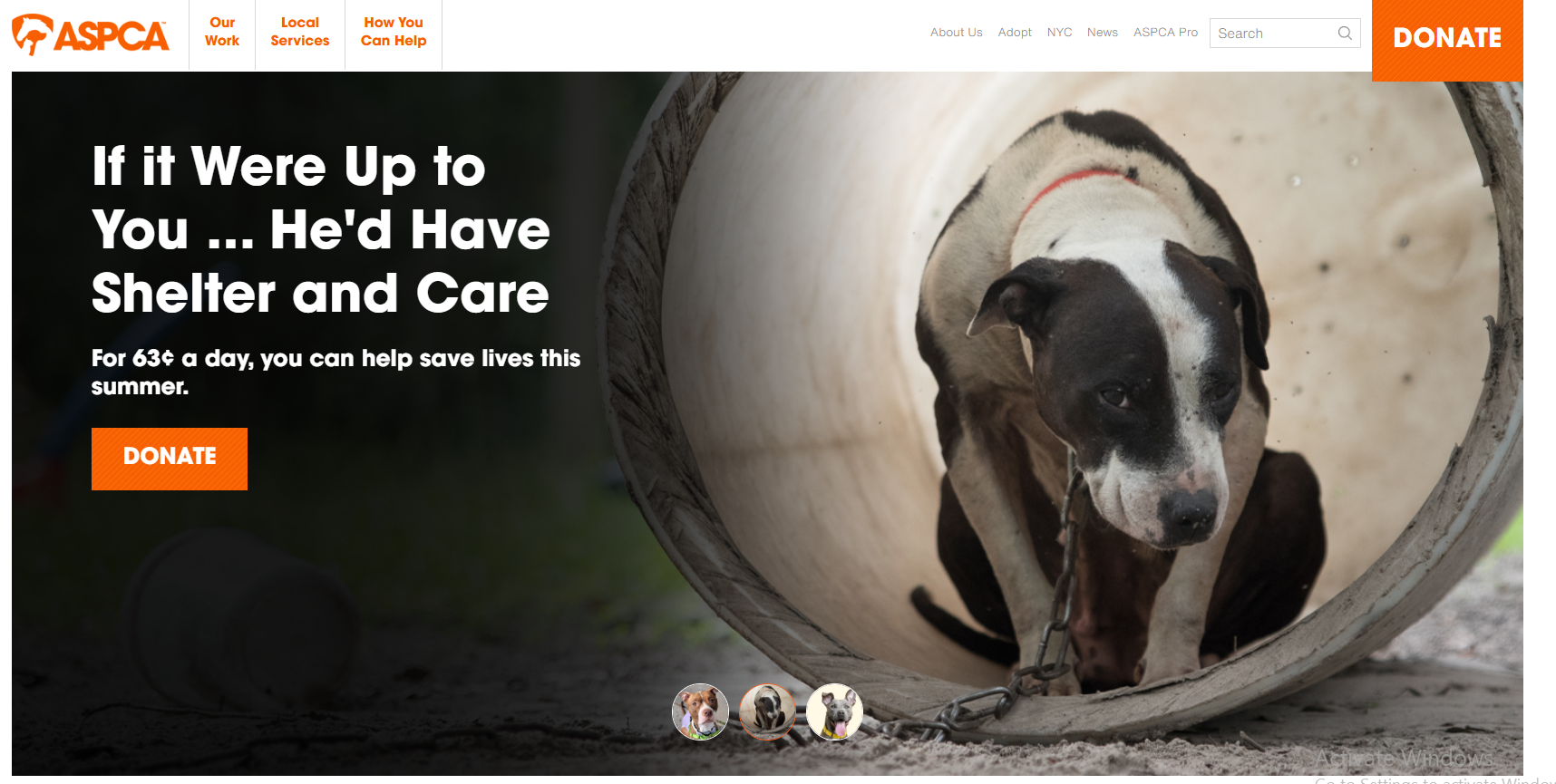
What They Do Well: Their donation flow uses prefilled amounts, visual progress indicators, and matching gift tools.
Why It Works: Clear, fast, and reassuring payment flows boost conversion rates.
How You Can Apply It: Streamline your join and renew process. Preselect amounts, show progress steps, and integrate employer match lookups.
OpenBiome – Trust Before the Ask
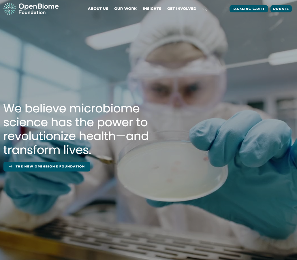
What They Do Well: Their site prioritizes critical resources for patients and healthcare providers, followed by impact statistics and press mentions.
Why It Works: Credibility drives conversion, especially in high-trust industries.
How You Can Apply It: Place trust-building elements—like testimonials, media logos, or impact data—directly before your join or donate prompts.
Association of Clinical Research Professionals (ACRP) – Career Pathway Mapping
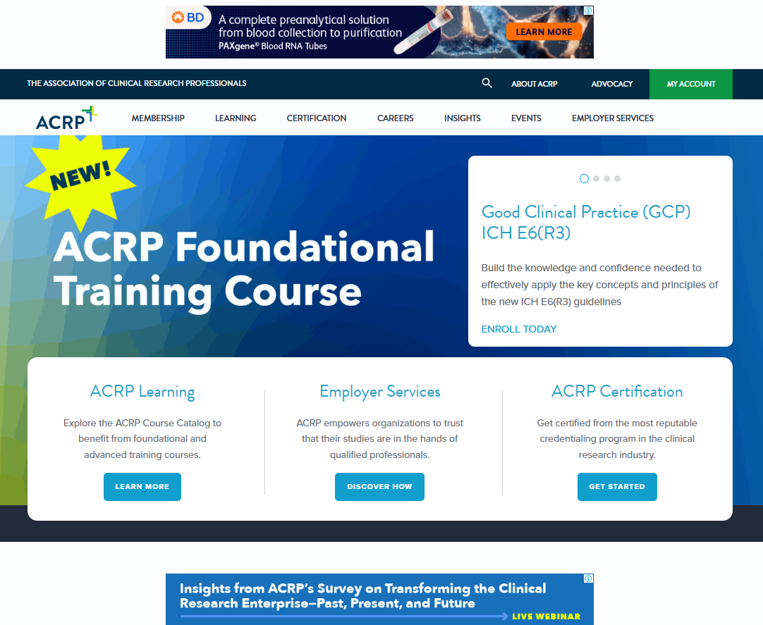
What They Do Well: They built a “Career Hub” with clear steps from entry-level to advanced professional certifications.
Why It Works: A membership site should be a roadmap, not a maze.
How You Can Apply It: Map your member journey visually—show potential members where they can start, grow, and succeed within your network.
Design and Content Patterns That Move the Metrics
Looking across these successful membership sites, a few patterns emerge:
Show Value Before Login: Give potential members a taste of exclusive content without full access.
Onboard in Context: Instead of overwhelming new members with tutorials, guide them through their first actions directly in the interface.
Make the Homepage Do Four Jobs: State your mission, prove relevance with current content, surface the top member task, and offer a clear membership option.
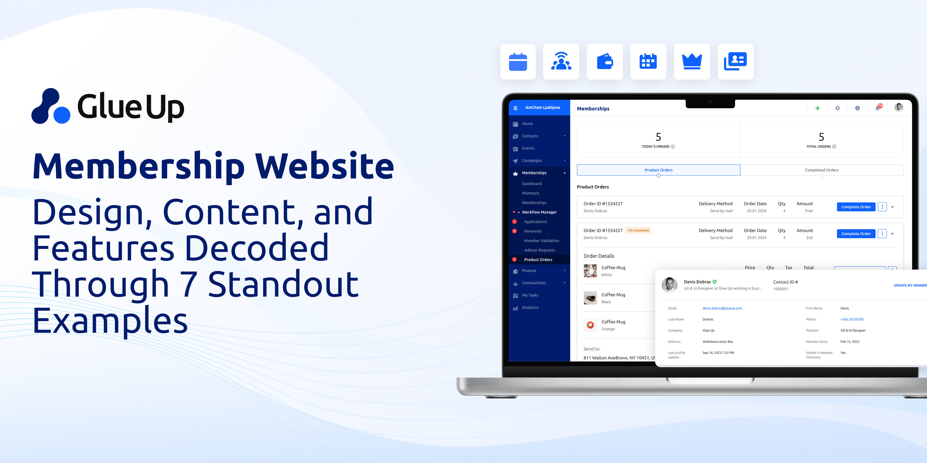
Invest in the Member Portal: A personalized dashboard with billing, profile updates, events, and resources is now baselining expectation.
How to Create a Membership Website
There are two main paths:
The Fast Path
Ideal for small chapters or pilot projects
Use website builders like Wix or Squarespace to launch quickly
Keep the focus on simple navigation, a clear join button, and basic gate content for members only content
Integrate social media for awareness and online courses for added value
The Professional Path
Ideal for larger associations, chambers, or nonprofits
Use an all-in-one online platform like Glue Up that merges membership management, events, payments, digital marketing, and exclusive content into one member only experience
Steps:
Define your membership model and membership levels
Map free content versus paid membership benefits
Design around top member tasks
Automate renewals, event registration, and content delivery
Launch with a feedback loop for optimization
How Much Does a Membership Website Cost
Website Builders: $20–$30 per month with hosting and templates included
WordPress with Membership Plugins: Hosting $10/month, plugins $150–$300/year, plus maintenance
Custom Builds with Integrated AMS: $5,000–$30,000+ depending on complexity and integrations
Hidden Costs: Payment processing fees, email automation tools, and ongoing content creation
Glue Up removes the multi-tool chaos by giving you a single subscription for your membership site, CRM, events, billing, and marketing.
Best Platform for a Membership Site
Builders: Best for speed and simplicity
WordPress with Plugins: Best for flexibility but higher maintenance
Course and Community Platforms: Great if your product is content-first
Association-Grade Platforms (Glue Up): Best for organizations needing events, dues, CRM, and members only content in one place
Association Membership Websites
Associations thrive when their membership sites integrate professional development, advocacy updates, and networking opportunities. Glue Up’s association-focused tools make it easy to offer online courses, member directories, CE tracking, and event management inside one portal.
Nonprofit Membership Websites
Nonprofits need more than a donate button. They need to tell their story through data, make it easy to join as a supporting member, and offer exclusive content like behind-the-scenes updates or members only webinars. Accessibility, transparency, and trust should be at the forefront.
The Launch Checklist
Before going live, check:
Mobile navigation
Page speed
Accessibility compliance
Payment flow testing
Analytics setup
Member portal personalization
A membership website is not a line item—it is your organization’s digital engine. When designed with intent, informed by real membership websites examples, and powered by a platform like Glue Up, it becomes the place where potential members turn into committed supporters and paid membership renewals become second nature.