By the time most boards talk about engagement dashboards, the year already feels settled.
Attendance has leveled out. Renewals follow familiar rhythms. Programs delivered what teams expected. The conversation moves quickly because everyone assumes they already understand what engagement looked like over the past year.
Then someone asks a simple question.
“Where exactly did members spend their time this year?”
The room slows. Slides flip. Tables appear. Someone explains totals and percentages. Another adds context from memory. A third offers interpretation based on experience rather than shared evidence.
That pause explains why engagement dashboards have become one of the most requested tools among member-based organizations planning for 2026. Leadership teams want shared clarity. They want engagement to feel visible, grounded, and easy to discuss as the new fiscal year approaches.
Dashboards change the conversation when they present the story clearly enough that everyone sees the same picture at the same time.
Key Takeaways
Most organizations already generate engagement, but interpretation remains fragmented. Engagement dashboards replace memory and explanation with a shared visual reference, allowing leadership teams to see the same engagement story at the same time.
Engagement dashboards work when they respect how people actually read them: quickly, between meetings, and with decisions already forming. Clear grouping, limited signals, and short interpretive cues reduce mental effort and improve discussion quality.
Generic dashboards fall short in member-based organizations. Effective association engagement reporting mirrors real structures like membership tiers, chapters, programs, communications, and renewals, so engagement feels recognizable and credible.
Boards, staff, and program owners ask different questions of the same data. Role-based engagement dashboards built on a shared foundation allow each group to see what matters most while staying aligned around consistent metrics.
When dashboards appear consistently in leadership reviews, board updates, and renewal planning, they shift from reports to operating rhythm. This consistency builds trust, sharpens planning for the new fiscal year, and supports better decisions heading into 2026.
Quick Reads
Engagement Already Exists. Visibility Decides How It Gets Understood.
Associations, chambers, and professional societies already generate engagement every day. Members attend events. They open emails. They join chapters. They participate in committees. They renew.
The challenge never sits in activity. The challenge sits in interpretation.
Spreadsheets fragment attention. Long reports slow decision-making. Slide decks depend on narration to make sense. Each format requires translation before insight emerges.
Member engagement dashboards solve a different problem. They compress complexity into a visual language leadership already understands. Participation becomes patterns. Trends become movement. Engagement becomes something teams can see rather than infer.
That shift matters more in 2026 planning cycles than in any prior year. Boards expect clarity. Staff teams operate across more formats. Hybrid programs connect physical and digital participation. Engagement now spans events, communications, learning, chapters, and payments.
Visualization turns scattered signals into one shared reference point.
Dashboards Work Because People Read Them Under Pressure
Dashboards rarely get reviewed in calm, focused moments. They get scanned between meetings, opened seconds before leadership discussions, and checked while decisions are already forming.
That context shapes everything.
A board member opens a dashboard five minutes before a meeting. A program director checks it between calls. An executive scans it while preparing next year’s budget during the new fiscal year planning cycle.
This is the real environment where engagement dashboards either help or fade into the background.
Pressure Changes How Information Gets Processed
Under time pressure, people look for signals. They want to answer a few immediate questions:
What changed since the last review
Where engagement increased or softened
Which areas deserve attention during the next planning window
That reality explains why engagement reporting tools rely on discipline rather than decoration. Every screen carries a cognitive limit. When dashboards respect that limit, clarity follows.
What Effective Dashboards Do Differently
Strong member engagement dashboards organize information the way people think under pressure. Instead of long metric lists, they use intentional grouping. Common groupings include:
Participation next to attendance: This pairing shows reach alongside commitment in one glance.
Engagement depth alongside frequency: Teams see how often members engage and how meaningful that engagement looks.
Program-level signals beside organization-wide trends: Context stays visible while details remain accessible.
Each section answers one clear question, then pauses. That pause matters. It gives the reader space to absorb meaning before moving on.
Why Interpretive Cues Matter in Engagement Analytics Reports
The most useful engagement analytics reports guide attention gently. They include small, deliberate cues:
A short headline that highlights what shifted
A brief caption that explains why the shift matters now
Visuals that stay consistent across views, so patterns feel familiar
These cues reduce friction. Meaning appears quickly. Readers spend less time decoding charts and more time discussing implications.
Mental Effort Shapes the Quality of Discussion
When dashboards feel easy to read, meetings feel different. Conversations move faster. Questions sharpen. Teams focus on decisions rather than explanations. Dashboards designed for real-world pressure help leadership teams:
Align around the same engagement story
Discuss trade-offs with shared context
Connect historical engagement patterns to next year planning
This is why dashboard reporting for associations plays such a central role as organizations prepare for 2026. Visibility supports confidence. Confidence supports better choices.
The Real Outcome of Well-Designed Engagement Dashboards
The value shows up quietly.
Meetings feel calmer. Reporting feels grounded. Engagement feels visible rather than abstract.
Dashboards succeed when they respect how people actually read them. Under pressure. In motion. With decisions already waiting.
Associations Need Engagement Reporting That Reflects How Membership Actually Works
Generic dashboards often treat users as interchangeable. Associations operate differently.
Membership status shapes pricing. Chapters create regional variation. Committees influence participation. Sponsors connect to programs. Renewals depend on perceived value built over time.
Association engagement reporting works best when dashboards reflect these relationships directly. Clear association dashboards often include:
- Participation by membership segment, showing how different member types engage across programs
- Event engagement views, connecting registration, attendance, and follow-up behavior
- Communication engagement summaries, tying opens and clicks to program participation
- Chapter and regional views, highlighting geographic patterns
- Renewal-adjacent engagement, showing activity levels prior to renewal periods
When dashboards reflect how associations operate, conversations shift from anecdotal explanations to shared understanding.
One Dashboard Rarely Serves Every Audience
Engagement only becomes useful when the right people can read it easily.
In member-based organizations, engagement touches many roles, yet each role looks for something different. A single dashboard trying to serve everyone at once usually ends up serving no one particularly well.
That reality explains why dashboard reporting for associations works best when dashboards reflect who is reading them and why.
Different Roles Read Engagement Through Different Lenses
Even when everyone looks at the same data, interpretation changes by responsibility. Common perspectives include:
Boards, who focus on direction, stewardship, and long-term value
Staff teams, who focus on execution, coordination, and workload
Program owners, who focus on improvement, format performance, and audience response
Each group asks a different first question when opening an engagement dashboard.
How Role-Based Engagement Dashboards Stay Aligned
Effective engagement dashboards for associations rely on role-based views built from a shared data foundation. The data stays consistent. The framing changes. Typical role-based views include:
Board view: Highlights engagement trends over time, comparisons across programs, and alignment with strategic priorities for the new fiscal year.
Staff view: Surfaces recent activity, participation shifts, registration behavior, and operational signals that support day-to-day decisions.
Program view: Focuses on specific initiatives, formats, chapters, or audiences to support refinement and iteration.
This structure keeps conversations grounded while allowing each role to see what matters most.
Why Shared Data Builds Confidence Across the Organization
When everyone works from the same engagement foundation, discussions feel steadier.
Leadership sees patterns. Staff sees progress. Program owners see opportunity.
Questions become more focused. Explanations shorten. Trust increases.
That consistency explains why association engagement reporting increasingly centers on role-based dashboards as organizations plan for 2026. The system supports alignment without forcing uniformity.
The Quiet Benefit of Role-Aware Dashboard Design
The real advantage shows up in meetings.
People stop arguing about numbers. They start talking about meaning.
Dashboards that respect roles turn engagement reporting into a shared language, one that supports direction, execution, and improvement at the same time.
Visualization Turns Engagement into an Operating Rhythm
Engagement dashboards start to matter when they show up often.
A dashboard reviewed once a year feels like a report. A dashboard reviewed regularly becomes part of how the organization thinks and works.
Influence grows through repetition.
Where Engagement Dashboards Earn Their Place
Dashboards gain real weight when they appear in familiar moments:
Monthly leadership reviews, where teams look for movement rather than explanations
Quarterly board updates, where trends matter more than isolated results
Program check-ins, where participation patterns guide adjustments
Renewal planning sessions, where engagement history frames value conversations
When engagement dashboards appear in these settings consistently, they stop feeling optional.
Rhythm Changes How Teams Talk About Engagement
Regular exposure builds familiarity.
Trends stop feeling surprising. Seasonality becomes visible. Patterns repeat in ways teams recognize.
This familiarity reshapes discussion during the new fiscal year. Leaders ask sharper questions. Staff spend less time confirming numbers. Program owners focus on next steps rather than context-setting.
Visualization turns engagement into something teams expect to review.
Consistency Reduces Friction and Increases Confidence
When dashboards operate as part of routine governance, trust builds naturally.
Data feels stable. Interpretation feels shared. Decisions feel grounded.
That trust explains why dashboard reporting for associations increasingly functions as infrastructure, especially for organizations planning for 2026. Dashboards support continuity across leadership transitions, planning cycles, and program changes.
When Dashboards Become Infrastructure
The shift happens quietly.
Engagement reporting moves from special requests to standing agenda items. Preparation time drops. Discussions deepen.
Visualization works best when it supports rhythm. Over time, that rhythm becomes one of the most reliable tools organizations have for making sense of engagement and carrying it forward into the next year.
How to Visualize Member Engagement Without Overwhelming Teams
Clarity remains the goal. Teams looking to strengthen how to visualize member engagement often follow a few practical principles:
- Limit each view to one primary question
- Group related metrics together
- Use consistent visual patterns across dashboards
- Include short explanatory text for context
- Review dashboards on a regular schedule
These practices help dashboards feel approachable for staff and credible for leadership.
Engagement Dashboards Work Best When Grounded in Real Behavior
Engagement becomes useful when it reflects what members actually do.
The most effective engagement dashboards for associations stay close to everyday actions. They do not try to interpret intent or predict outcomes. They focus on observable behavior that teams already recognize and trust.
This grounding keeps engagement reporting credible across leadership, staff, and program teams.
The Behaviors That Belong in Engagement Dashboards
Strong dashboards center on participation signals members generate naturally:
Event attendance, showing who shows up and how often
Session participation, reflecting depth within programs
Email interaction, revealing communication reach and responsiveness
Community activity, indicating ongoing involvement beyond events
Chapter involvement, highlighting geographic and local engagement
Program enrollment, connecting interest to commitment
These actions form the backbone of reliable member engagement dashboards.
Why Historical Data Creates Clarity
Historical engagement data carries an advantage. Everyone agrees on what happened.
When teams review engagement across periods, patterns emerge without debate. Seasonal shifts become visible. Program changes show impact. Engagement rises and settles in familiar cycles.
This shared understanding allows engagement analytics reports to support meaningful discussion rather than speculation.
Comparison Builds Context Without Overcomplication
Comparing engagement across time frames gives dashboards depth without complexity. Common comparisons include:
Month over month during active seasons
Program cycles across the year
Engagement before and after major initiatives
These views help teams discuss implications together, grounded in evidence rather than assumption.
Real Behavior Supports Better Planning for the Year Ahead
When engagement dashboards stay anchored in real behavior, planning improves.
Teams enter next year discussions with confidence. Conversations focus on refinement rather than correction. Leadership sees continuity between past activity and future direction.
This is why organizations preparing for the new fiscal year treat behavior-based engagement dashboards as a foundation for thoughtful planning.
Reporting Engagement Metrics That Leadership Trusts
Engagement reporting only works when leaders trust what they are seeing.
Trust builds over time, and it starts with stability. Metrics that shift definitions, change logic, or appear inconsistently across reports weaken confidence quickly. Leaders need to recognize the numbers before they believe the story.
Why Stability Matters More Than Sophistication
Clear reporting member engagement metrics rely on consistency rather than complexity.
When the same measures appear month after month, leaders learn how to read them. Trends become familiar. Movement feels meaningful. Questions focus on interpretation rather than accuracy.
Stability allows engagement dashboards to function as reliable references during planning conversations for the new fiscal year.
The Role of Shared Metric Definitions
Strong engagement reporting often includes a simple, shared definition document. This document answers a few essential questions:
What each engagement metric represents?
How the metric gets calculated?
Which data sources feed the metric?
How often the metric updates?
When teams agree on these definitions, discussions move faster and feel more productive.
Clarity Reduces Friction During Leadership Reviews
Shared definitions prevent common points of confusion.
Numbers do not need to be re-explained. Variations feel understandable. Historical comparisons stay valid across reporting periods.
This clarity supports association engagement reporting that feels dependable during board meetings, staff reviews, and renewal planning sessions.
Trust Turns Dashboards into Decision Tools
Once trust forms, dashboards take on a different role.
Leaders stop questioning the numbers. They start asking better questions about direction, priorities, and resource allocation.
Metrics that remain stable and well-defined give engagement dashboards the credibility they need to support real decisions, year after year.
Choosing Membership Engagement Reporting Software for 2026 Planning
As organizations evaluate membership engagement reporting software, attention often centers on usability rather than complexity. Teams look for:
- Centralized data across events, membership, and communications
- Flexible dashboard views for different roles
- Exportable reports for leadership and board use
- Consistent metric definitions across modules
- Visual formats that support quick understanding
Software that supports these needs helps engagement reporting feel practical rather than burdensome.
Engagement Dashboards Change Conversations Before They Change Decisions
The most valuable shift happens quietly.
Meetings feel calmer. Discussions feel grounded. Leaders ask better questions. Staff share insights with confidence.
Engagement stops feeling abstract. It becomes visible, discussable, and shared.
That outcome explains why engagement dashboards continue gaining attention as organizations prepare for 2026. Visibility shapes understanding. Understanding shapes direction.
Dashboards serve that purpose when they respect how people think, how associations operate, and how leadership conversations actually unfold.
When engagement becomes visible, it becomes manageable.
Most organizations update engagement dashboards monthly, with lighter weekly refreshes during busy event or renewal periods.
Ownership usually sits with operations or membership teams, with shared review responsibility across leadership and program owners.
Dashboards help new board members quickly understand participation patterns, seasonal cycles, and how engagement connects to organizational priorities.
Dashboards work well for hybrid programs when they present in-person and digital participation together in one consistent view.
Teams usually select metrics that align with strategic goals, board priorities, and recurring leadership questions rather than tracking everything available.
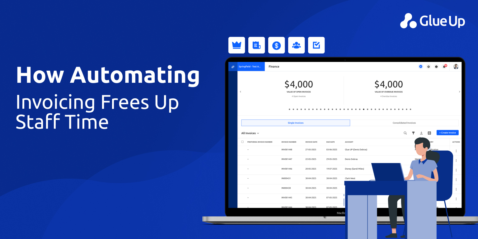
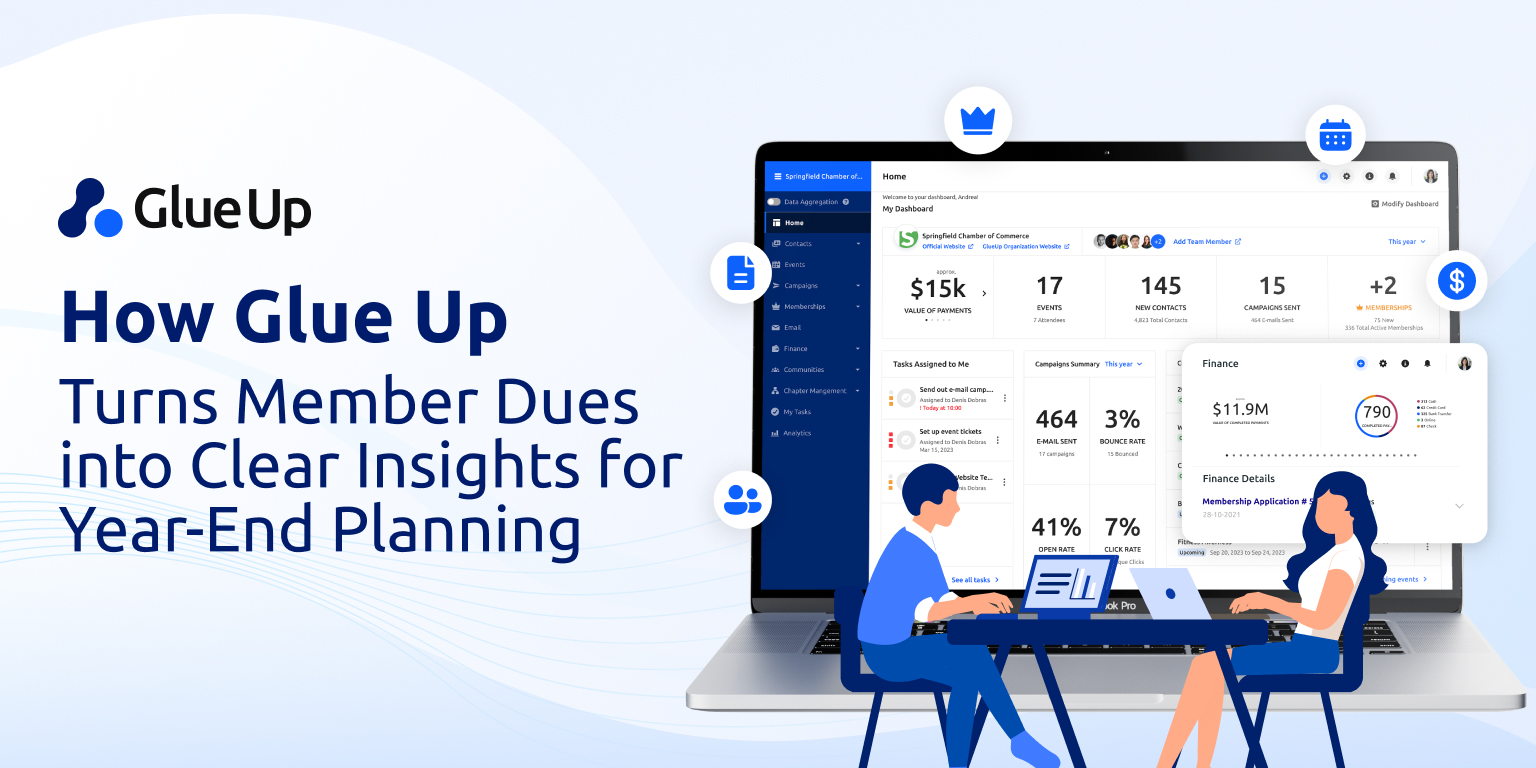
Glue Up brings membership, events, email engagement, payments, and chapter activity into one system, creating a unified source for dashboards.
Glue Up allows teams to present engagement data differently for boards, staff, and program owners while using the same underlying records.
Engagement data in Glue Up can be exported and shared in formats commonly used for board packets and leadership presentations.
Glue Up retains historical participation and interaction records so teams can review engagement patterns across multiple periods.
Engagement dashboards in Glue Up draw from membership management, event management, email campaigns, finance, and chapter activity modules.